In this project you are going to build on the skills and elements and principles of art and design that you learned and practiced in the first project: Composition, Balance, Shape, Line, Negative, Positive, Color, Scale, Proportion and Design. (for refresher on these terms please check out the Elements and Principles of Art and Design page here)
Adding to those, you will need to familiarize yourself with these new ones.
Value - is the degree of light and dark in a design. It is the contrast between black and white and all the tones in between. Value can be used with color as well as black and white.
Contrast - Contrast is the extreme changes between value, colors, objects, space, and other elements. It can be used as a tool to show emphasis within a design.
Emphasis - is used by artists to create dominance and focus in their work. Artists can emphasize color, value, shapes, and other art elements to achieve dominance.
Repetition, Pattern, Rhythm - Repetition is the use of same or similar elements multiple times (usually 3 or more) within an image or design. Pattern is when elements are repeated with purposeful organization. Rhythm is the purposeful repetition of multiple patterns.
Variety, Harmony, Unity - Variety is created by all the differences in an image; from the colors used and the marks made to the different elements that comprise the image. Harmony is created by the element/s that bring an image together. Those elements can be color, shape, size, theme, balance, etc. Unity is achieved when Variety and Harmony are in balance within an image so that the whole composition works as a total visual.
Illuminated Letters
Now that you know all the right terms, let's talk about what you are going to make.
For this project you are going to create your own unique Illuminated Letters.
Using your chosen letter or letters, you will create a design focused on not only the letter form that you choose to use but also the design, color, patterns, embellishments and narrative that you add to it to create a fully developed work of art. All the elements of your design should be driven by your chosen theme. Your theme could be something about you (appropriate if you choose to use your initials) or it could be illustrating a word associated with your chosen letter/s. You could also choose to work with a specific art form like graphic design, or an art movement or era like Art Nouveau.
Your finished design must:
- Use one or two clearly defined and readable letter forms
- Use gold as a visual element
- Final design must measure 13"x18" (your illustration board is 15"x20" so you will need an inch border on sides)
- Employ visual elements (patterns, shapes, characters, other, in addition to letter forms to enhance the narrative of the work
- Use at least 4 different colors (not including gold)
- Have a clear theme/narrative
- Show high level of craftsmanship
- Be dynamic and visually interesting
- Employ the elements and principles of design discussed in class (also defined above).
|
Supplies (from your kit)
|

|
Alternate supplies
|
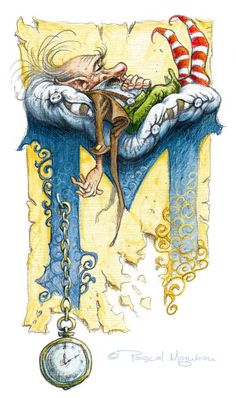
Examples of Illuminated Letters
Not all of these meet the project requirements. These are only meant as inspiration for you as you create your own unique work. Look at these images and think about what you want to make. Is the letter clear? What is the theme? Is the Theme clear? Is it interesting? Does there seem to be anything missing? Could it use a background or no background? Is it too chaotic? What about it do you like that you could maybe use in your own work? What don't you like? Do you like the overall style? Do you like the use of color?
What other questions can you come up with when you look at these?? Write down what you like about these so that you can come back to them when you are designing your work.


